

Anonimo
The Problem:
As of June 2020, there has been a 13% increase in the US of individuals increasing substance use or starting for the first time. The increase in stress and lack of social contact have contributed to substance use.
The Goal:
Design an app that will help educate and connect individuals who have struggled or a currently struggling with addiction.
01
Project Overview
My role:
UX Designer leading the app and responsive website from conception to delivery
Responsibilities:
Conceptualizing the product, conducting user research, paper and digital wire framing, facilitating interviews and usability studies, low and high fidelity prototyping.
02
Research Summary
I used my background as an Addictions Counselor as well research in the field to develop my interview questions. Most interview participants reported feeling stigmatized and alone as a cause for a continuation of their use. The feedback received from the interviews revealed a need for a form of connection as well as a place where the participants would not feel judged.

Click to view the full competitive audit
03
Persona
Problem statement:
Susy is a single mom of 2
who needs to find a way to connect with others in the recovery community
because she finds it difficult to do it alone.
04
Ideation
I did an ideation exercise focused on wireframes that would address the needs identified through the competitive audit on how the features could be presented.

05
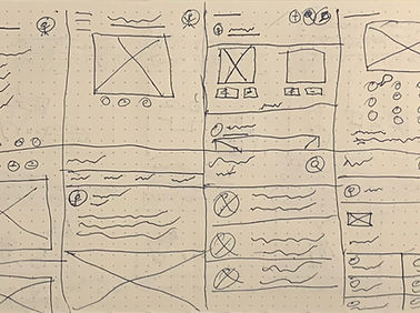
Digital Wireframe
Due to the lack of awareness of information when it comes to recovery as well as the lack of community, I developed a wireframe that focused on informing and connecting the user to others on the platform. For example, in the Mockup above the middle Lo-Fi Prototype, the top half would content that would inform the user. While the content is playing, other users can chat and comment on the video which is at the bottom half of the Mockup.

Click to view the full Anónimo lo-fi prototype
06
Low-Fi Prototype
In order to prepare for a usability test, I created a low fidelity prototype that established a user flow demonstrating the app’s main features.
07
Usability Study: findings
Interface:
People want an easier way to navigate through the app
Distinction:
People had difficulty in differentiating the features
Simplicity:
People preferred a simple design


08
Mockups
Additional design changes included keeping its simplicity but also establishing a distinction among the different features of the app.

View the Anónimo high-fidelity prototype
09
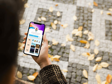
High-Fidelity Prototype
The high-fidelity prototype followed a similar user flow as the low-fidelity prototype, especially through the insights gathered from the usability study.

10
Sitemap
Once the app designs were completed, I began work on a responsive website. I began the process by developing a sitemap that will help guide its development.

View the Anonimo Web Design
11
Responsive Designs
The designs for screen size variation were for the mobile and desktop frames. I set to optimize and maintain its simplicity to keep the user’s needs in mind.

12
Accesisibility
-
Icons and Labels that are at a size that can be readable and accessible to screen readers.
-
Used color schemes to help the user navigate the app.
13
Takeaway & Next Steps
Takeaway:
This design looks to address the needs of many individual’s path to recovery. While they can find solace and support in different groups and therapies, once they leave those settings it can be difficult to maintain focus on their path of which Anónimo looks to fill the gap. One quote from a user was that “I could really see how this could be useful today!”
Next Steps:
-
Conduct another usability study to confirm if pain points were taken care of.
-
Incorporate what may be learned in developing design features that may be useful in this project.
-
Continue user research to see if there are other aspects to address that the competitors may be missing.